

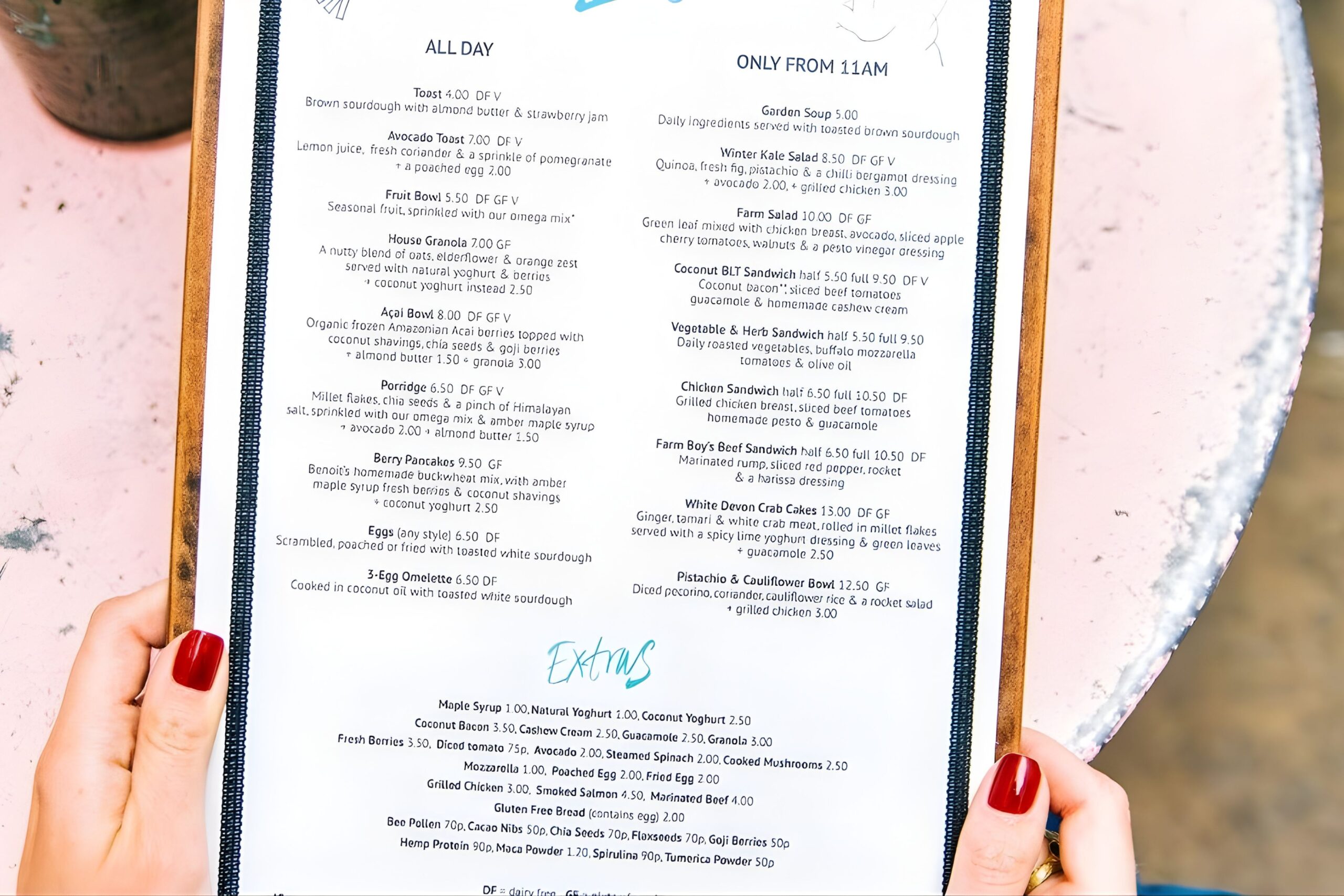
Understanding Menu Card Psychology
First, recognize that customers spend an average of 90 seconds reviewing your menu card. Their eyes typically move to the upper right corner initially. Consequently, placing high-profit items in this prime location increases their selection rate.
Additionally, menu card layout affects perceived value. White space creates elegance and sophistication. However, cluttered designs overwhelm customers and slow decision-making. Thus, balance is essential for professional presentation.
Furthermore, color psychology impacts appetite and choices. Warm tones like red and orange stimulate hunger. Meanwhile, green suggests freshness and health. Therefore, strategic color application enhances your menu card effectiveness.
Pricing Strategy Fundamentals
Next, consider how you display prices on your menu card. Research shows that removing currency symbols increases spending by 8%. For example, writing “24” instead of “$24” reduces price sensitivity.
Moreover, avoid using leader dots between items and prices. These design elements draw excessive attention to costs. Instead, integrate prices naturally within descriptions. This approach keeps focus on food quality and experience.
Also, implement strategic price anchoring throughout your menu card. Place premium items first to establish value expectations. Subsequently, mid-range options appear more reasonable and attractive to customers.
Visual Hierarchy and Layout
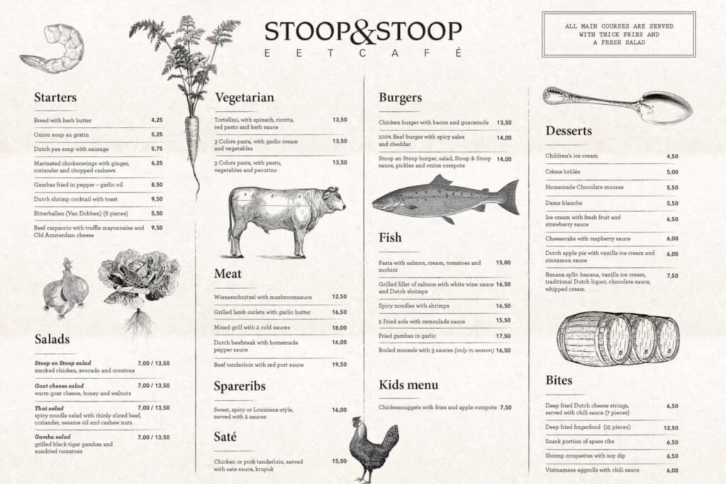
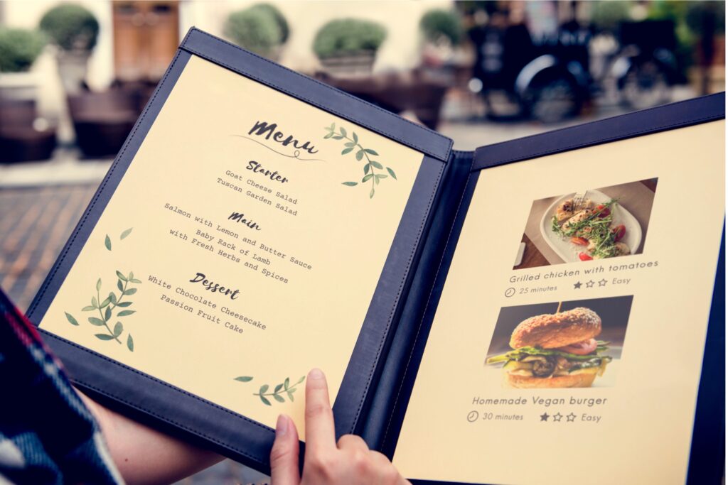
Creating effective visual hierarchy transforms your menu card into a sales tool. Bold typography directs attention to featured dishes. However, maintain consistency in font choices for professional appearance.
Additionally, organize items into logical categories with clear headings. Appetizers, mains, and desserts require distinct sections. Therefore, customers navigate your menu card effortlessly and confidently.


Furthermore, limit options within each category to prevent decision paralysis. Indeed, offering 7-10 items per section optimizes choice satisfaction. Consequently, customers order faster and feel happier with selections.

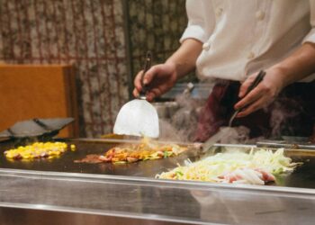
Autumn equinox and how cooks rethink heat
The autumn equinox is not simply a date on a calendar. It is the moment when serious cooks across the...
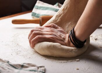
Bread traditions and what they reveal
Bread traditions are among the oldest and most honest records of human civilization. From the grain a community grows to...
Conclusion
Implementing these menu card strategies positions your restaurant for increased profitability in 2026. Focus on clear layout, strategic pricing, and compelling descriptions. Moreover, remember that your menu card serves as a silent salesperson working continuously.
Therefore, regular updates keep offerings fresh and relevant. Indeed, professional menu card design separates successful establishments from struggling competitors. Start optimizing your menu card today to maximize customer satisfaction and revenue growth.











The point about not aligning all the prices in a neat column on the right was the one tip I had never seen elsewhere. Makes perfect sense though, the moment they line up like a supermarket receipt people start comparing numbers instead of considering the dishes. Going to redesign ours this month with the prices tucked discreetly at the end of each description.